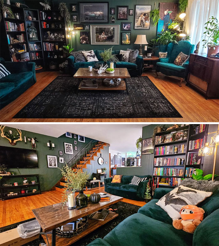
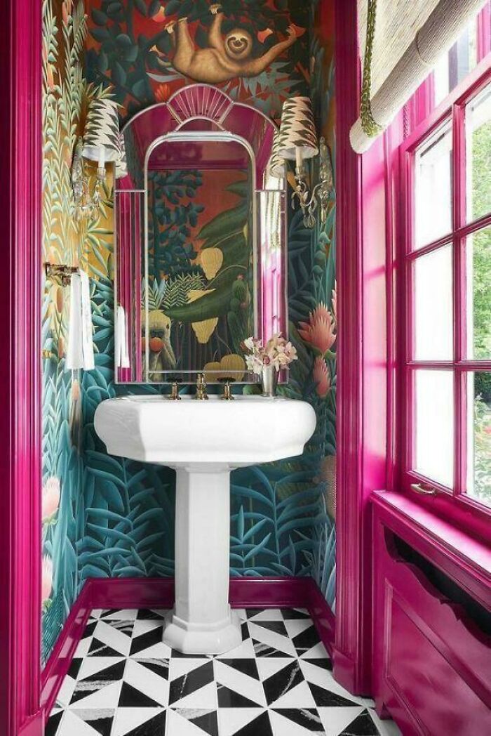
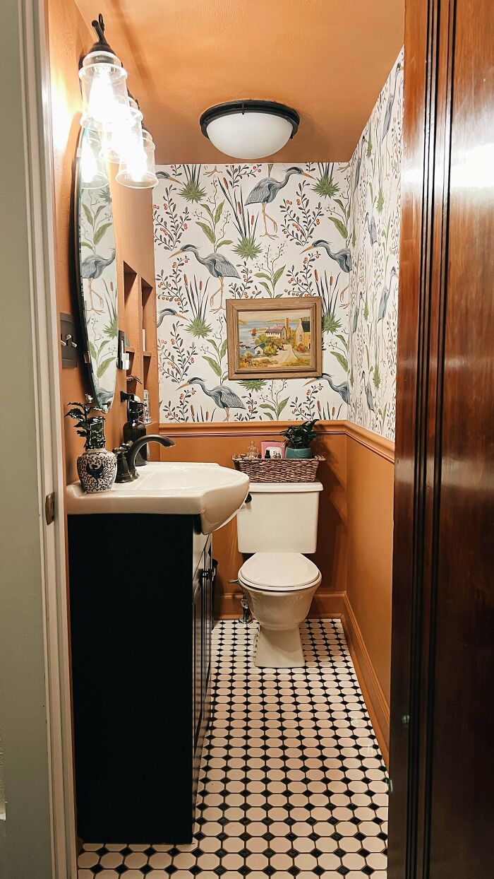
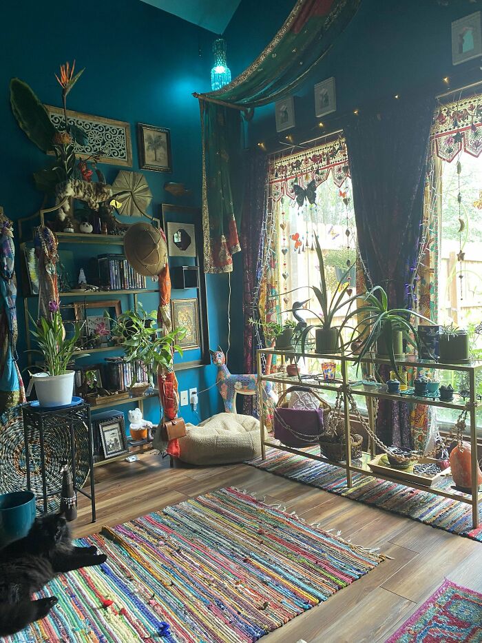
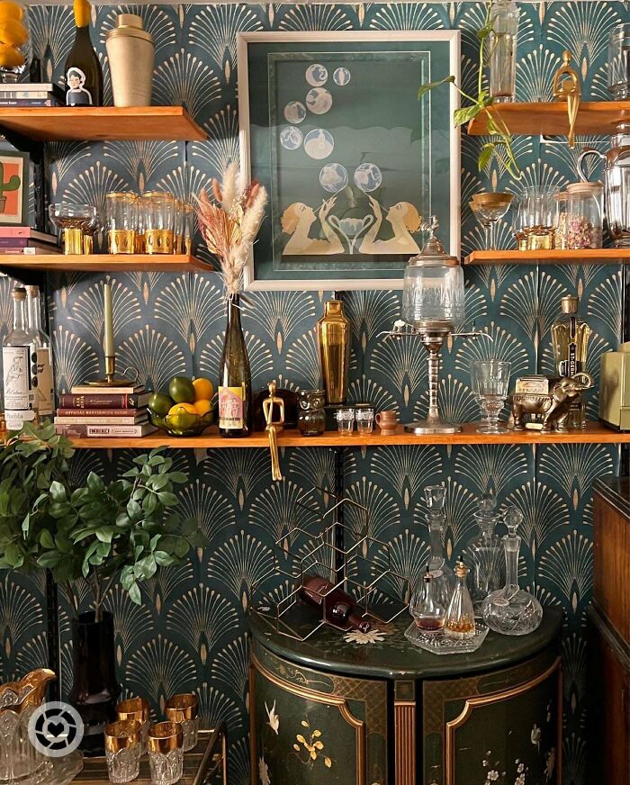
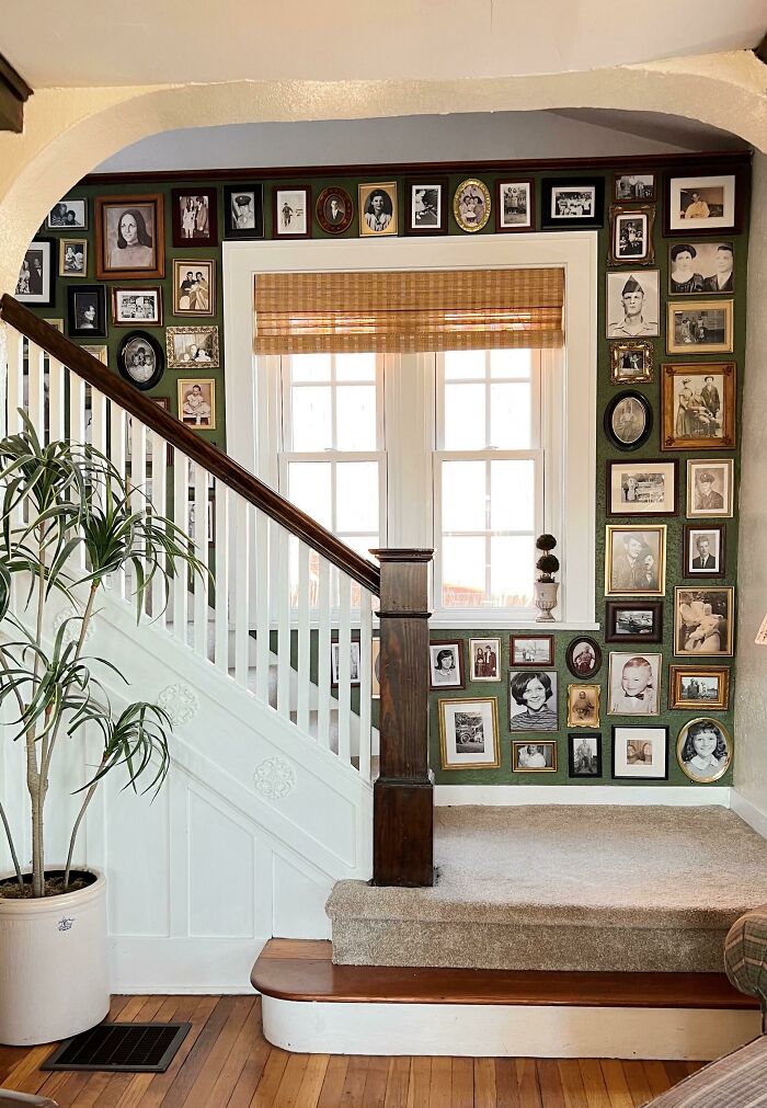
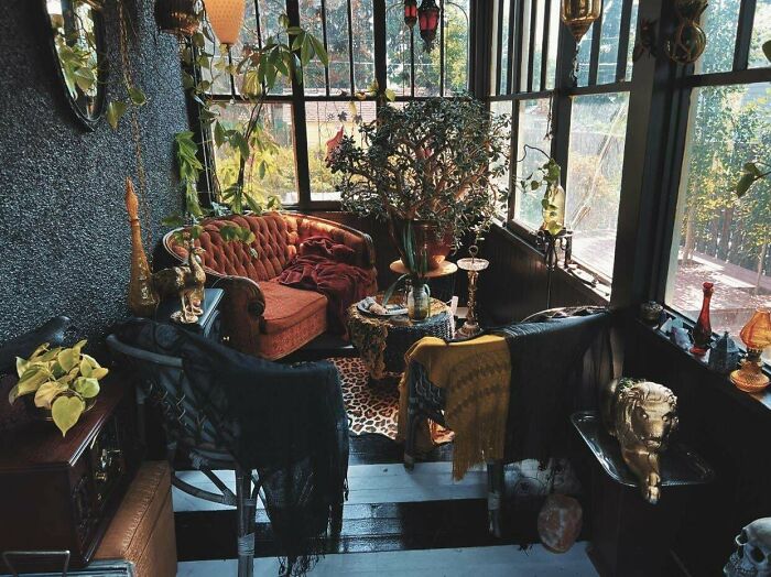
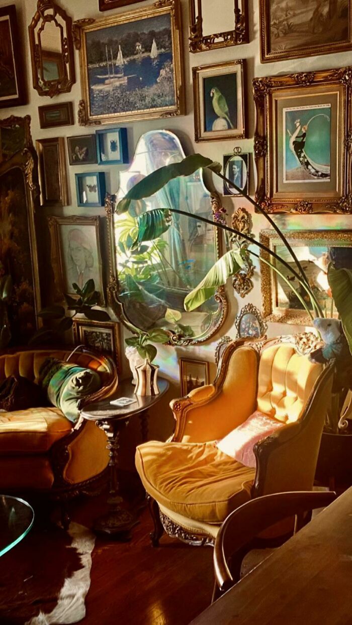
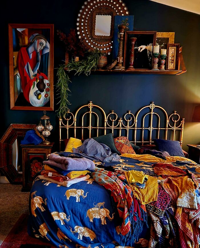
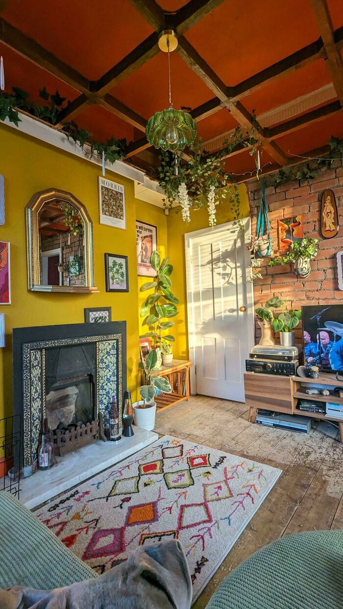
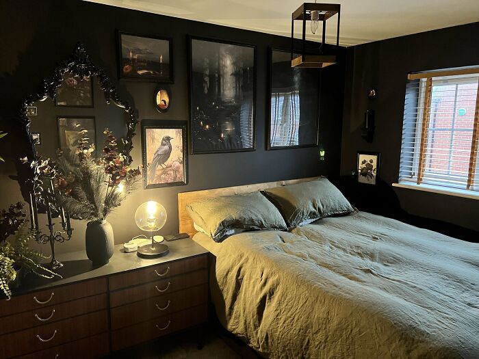
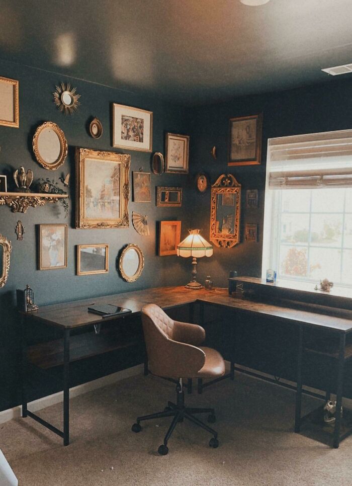
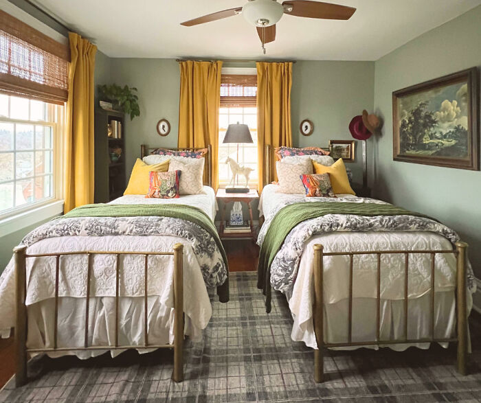
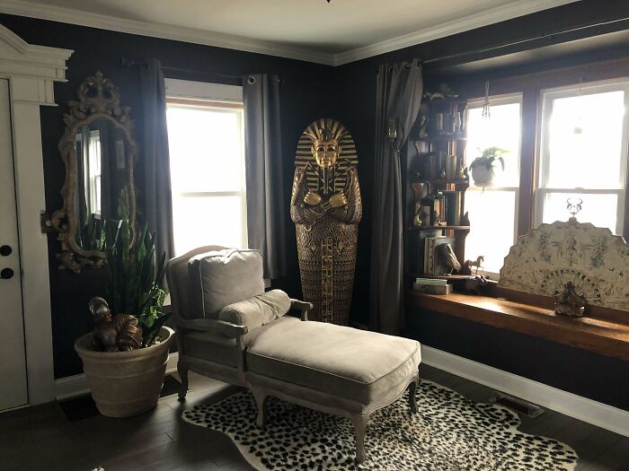
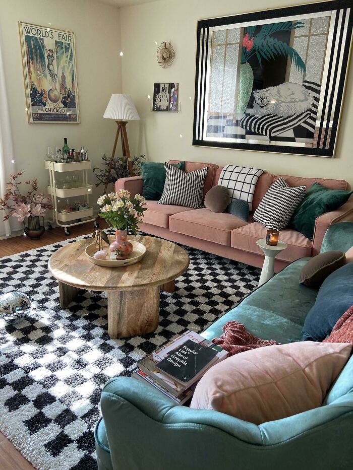
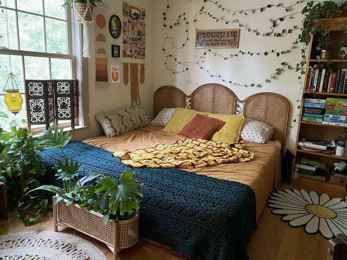
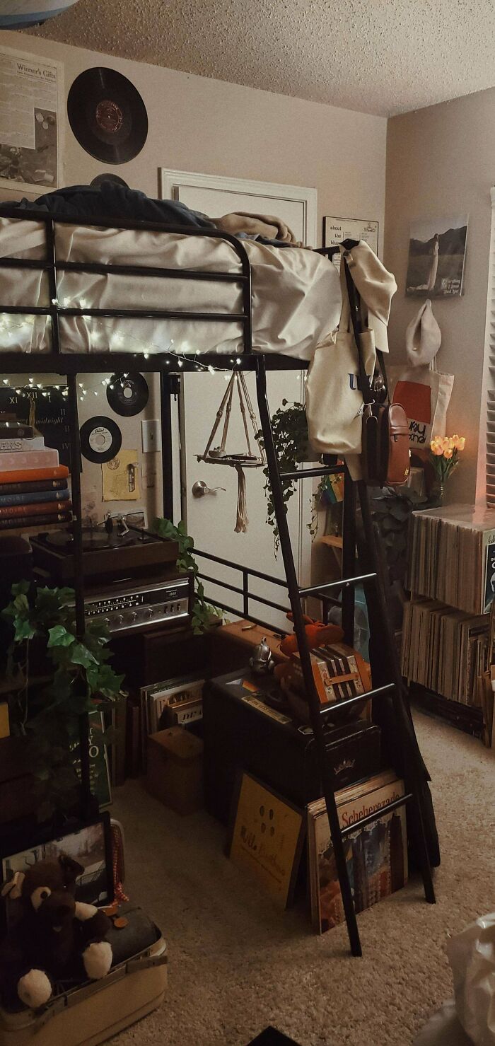
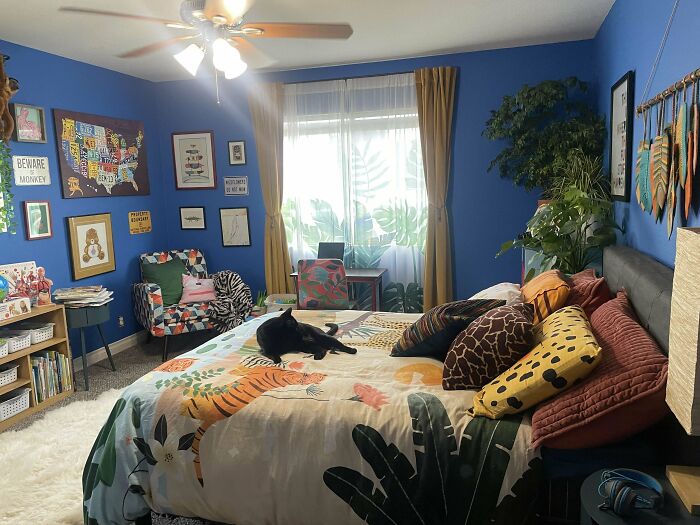
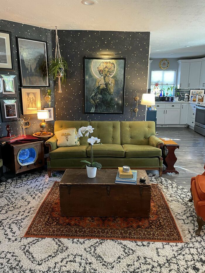
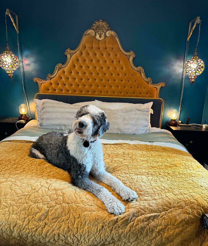
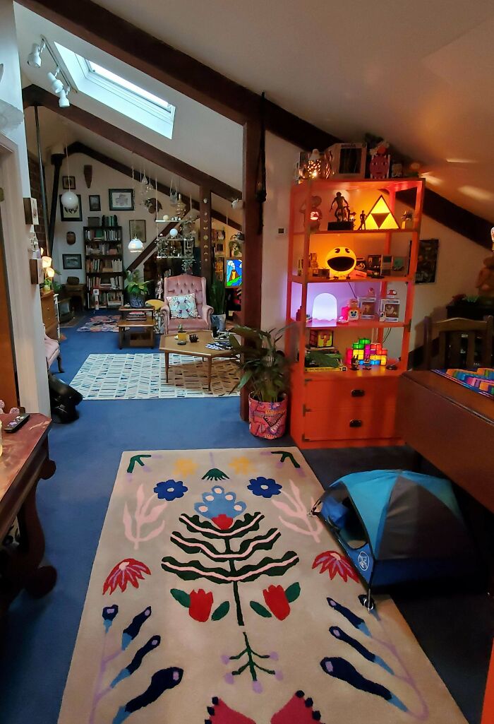
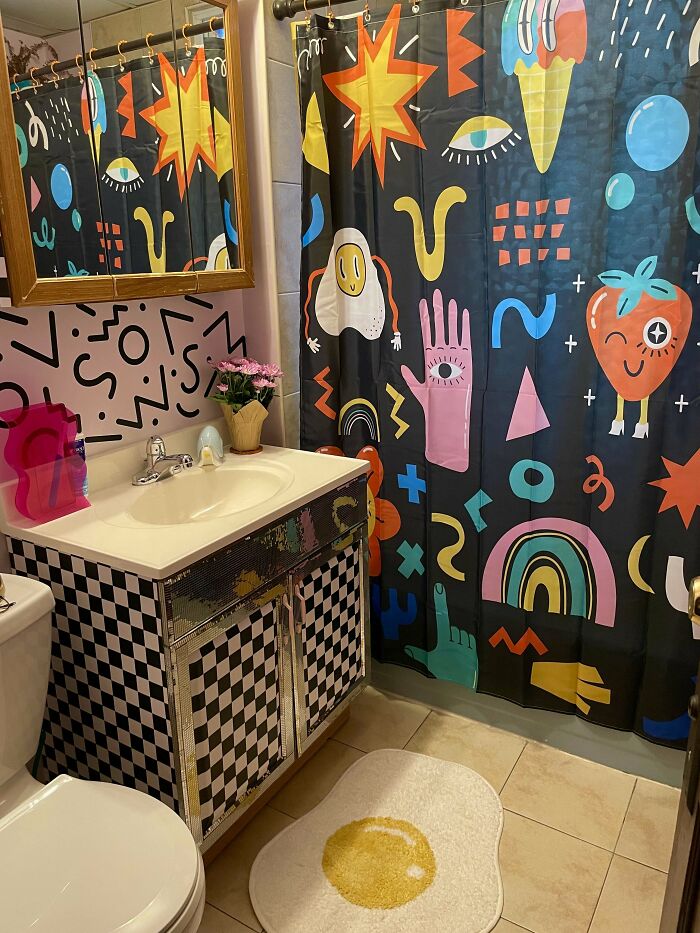
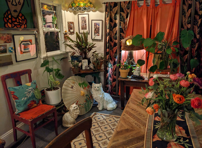
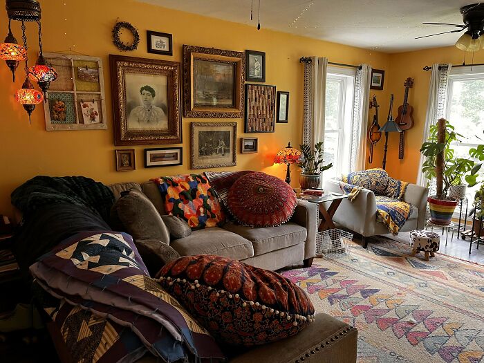
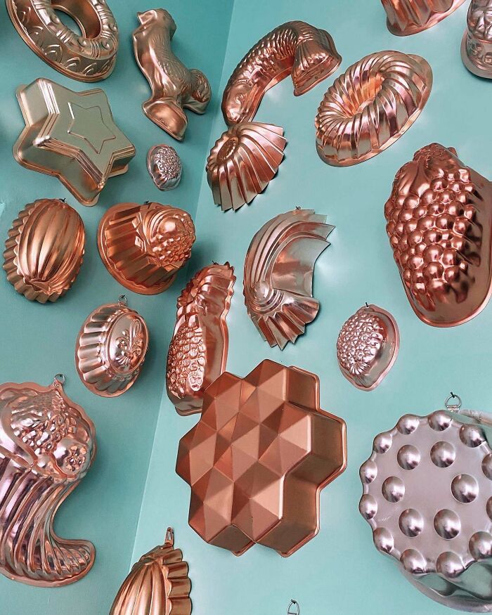
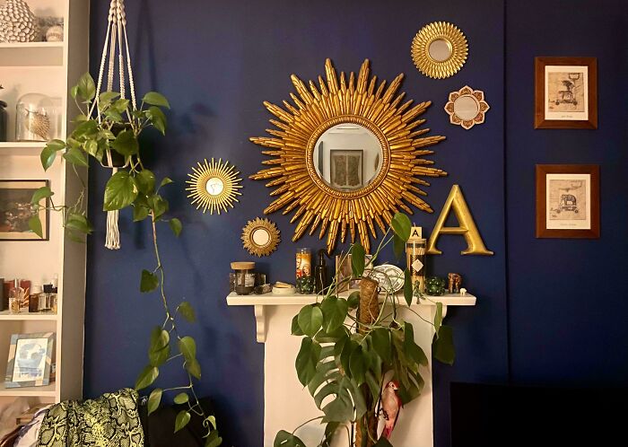
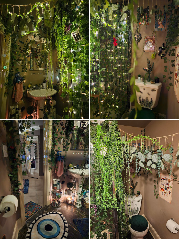
A home is a sanctuary; it’s a place to rest and recharge. So, we model it and decorate it in a way that brings us the most comfort. For some people, it’s all about empty spaces, decluttering, and minimalism. But others live by the motto that more is actually more. For them, it’s all about color, eccentricity, and excess. These people are maximalists, and today, we’re covering the sanctuary of their aesthetic – the Maximalism subreddit. Its enthusiasts reject the sad beige millennial aesthetic and celebrate colors, shapes, and textures. Today, we’ve got a selection of the most stunning maximalist interior designs to inspire you for your next home makeover. The interior design aesthetic dominated by neutral colors and decluttered spaces has been long associated with millennials. Not that long ago, Bored Panda wrote about the differences between Gen Z and millennial decor. People were pointing out the equivalents of millennial interior design trends to what Gen Zers choose today. Like how fairy lights were all the rage back in the day, and today, people opt for neon strips. Business Insider describes de-modernization as “an interior design aesthetic that values secondhand furnishings, items built to last, and interiors that speak to the personality of the homeowner or renter.” And most proponents say they don’t wish it to become a trend; they want it to be a movement. They recommend colorful interiors for people who deal with low moods often or struggle with depression. However, some rooms might need to have a more calming aura about them, like a bedroom or a bathroom. That’s why more muted, cold colors that bring energy levels down might be a better option in these rooms. When done right, maximalist design can be very pleasing. Archwhispers write that the trick is “to group similar objects and avoid negative space altogether.” They also advise “to use colour & material repetition and similar textures to anchor the look rightly” for a more cohesive maximalist look. “This way, you aren’t incorporating too many areas where patterns can clash, and you also allow yourself the opportunity to swap things out if you eventually get sick of a pattern or color scheme,” Designer Ariel Okin told Apartment Therapy. To achieve the look of curated chaos, Designer Ana Claudia Schultz recommends layering items using different heights or depths of field. That means not putting things in a perfectly straight line. “Move one piece off-center and center the other,” Schultz explained to Apartment Therapy. Follow Bored Panda on Google News! Follow us on Flipboard.com/@boredpanda! Please use high-res photos without watermarks Ooops! Your image is too large, maximum file size is 8 MB.
